...
Components based on UX Style Board
...
Implementation details (e.g. supported properties) can be added later on to increase the usefulness of this documentation.
Inputs
| Info |
|---|
Custom placeholder can be defined for all inputs but “FileUploader” FileUploader and GeocodeAutocomplete. |
Input
Default:
...
Focused:
...
Filled:
...
With isInvalid property set to true:
...
GeocodeAutocomplete
| Info |
|---|
When a suggestion gets selected the onChange function passed to the component is called with the following object as an argument: |
| Code Block |
|---|
|
{
  countryName: String,
  countryCode: String,
  regionName: String,
  cityName: String,
  longitude: Number,
  latitude: Number
} |
| Info |
|---|
When the input is cleared using the x button the onChange function passed to the component is called with null as an argument. |
Default:
...
Focused:
...
When typing:
...
With suggestion selected:
...
Buttons
IconButton
Default:
...
| Info |
|---|
Rendered as button by default. Provide click handler in ‘onClick’ onClick property. |
| Info |
|---|
Rendered as a hyperlink when ‘type’ type property is set to ‘link’ link. Provide ‘href’ href property. |
Default:
...
Focused:
...
| Info |
|---|
Rendered as button by default. Provide click handler in ‘onClick’ onClick property. |
| Info |
|---|
Rendered as a hyperlink when ‘type’ type property is set to ‘link’ link. Provide ‘href’ href property. |
Default:
...
Focused:
...
Default (with example of use):
...
On ‘Edit’ Edit button click (with example of use):
...
If ‘isDirty’ isDirty property is set to ‘true’ true (with example of use):
...
On ‘Submit’ Submit button click (with example of use):
| Info |
|---|
‘Submit’ Submit and ‘Cancel’ Cancel buttons are disabled and spinner is displayed as long as ‘isMutating’ isMutating property is set to ‘true’ true. |
...
ValidationError
With value property set to This field is required:
...
ConfirmActionDialog
| Info |
|---|
Props: title - String, title of a dialog
message - String, message of a dialog
isOpen - boolean, show the ConfirmActionDialog - Boolean, if true - dialog is shown, if false - dialog is hidden
onClose - pass handle void, function to hide the ConfirmActionDialog, called to close a dialog
onConfirm - executes the action void, function called after pressing the “Confirm” "Confirm" button
isConfirming - booleanBoolean, if true "Confirm" button is disabled and spinner is displayed
|
Default (with an example of use - Organization deletion action):
...
On ‘Confirm’ Confirm button click (with an example of use - Organization deletion action):
| Info |
|---|
‘Confirm’ Confirm button is disabled and spinner is displayed as long as ‘isConfirming’ isConfirming property is set to ‘true’ |
...
...
Dialog
| Info |
|---|
Props: children - body of the dialog, passed as component's child - between opening and closing tags
isSubmitInProgress - Boolean, if true submit and cancel button is disabled and spinner is displayed
formId - String, used for submitting form, formId should be the same as id property passed to form component, e.g. <form id='some-id'>
isOpen - Boolean, if true - dialog is shown, if false - dialog is hidden
onClose- void, function called to close a dialog
submitButton - Boolean, if true - submit button is shown
cancelButton - Boolean, if true - cancel button is shown
closeButton - Boolean, if true - close button is shown
dialogType - String (DialogType enum may be used), used to style dialog differently for each type
|
Default (dialogType = DialogType.DETAILS):
...
dialogType = DialogType.FORM (with an example of use - create new Tag)
...
| Info |
|---|
Props: objectId - Number, id of an object, used to fetch a list of comments for an object with the provided id.
objectType - String, type of an object, accepts values: PRODUCT, ORGANIZATION, PLAYBOOK, BUILDING_BLOCK, OPEN_DATA, USE_CASE, PROJECTS, used to fetch a list of comments for an object of the provided type
commentsSectionRef - Object, ref object, ref used by CommentsCount component to scroll down to CommentsSection component on CommentsCount click
|
Example of use:
Default view, when there is no comments
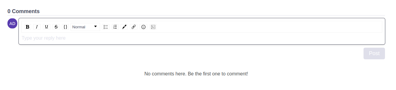 Image Added
Default view, with comments
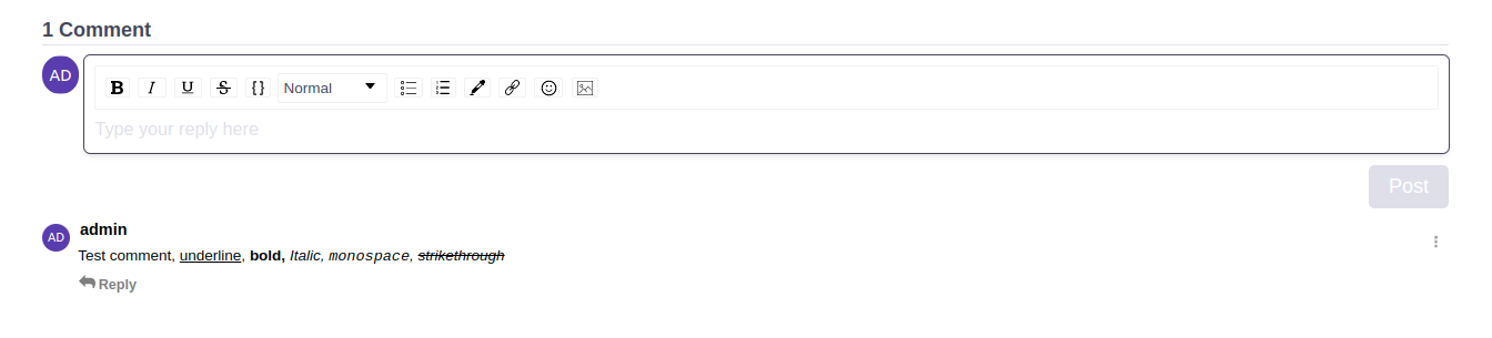 Image Added
 Focused input
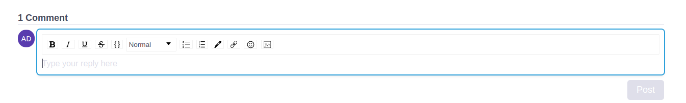 Image Added