Components based on UX Style Board
Implementation details (e.g. supported properties) can be added later on to increase the usefulness of this documentation.
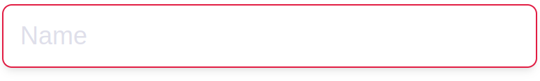
Inputs
Custom placeholder can be defined for all inputs but “FileUploader”.
Input
Default:
Focused:
Filled:
With isInvalid property set to true:
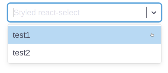
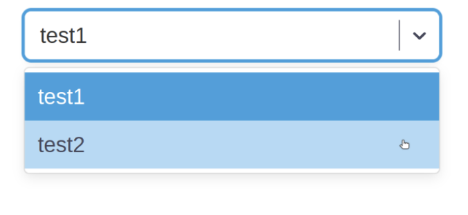
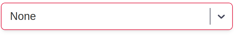
Select
Default:
Menu open:
Selected:
Selected with menu open and hover:
With isSearch property set to true:
With isInvalid property set to true:
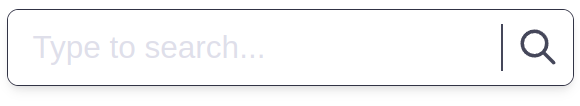
SearchInput
With search triggering function provided in props:
Without search triggering function provided in props:
Focused:
Filled:
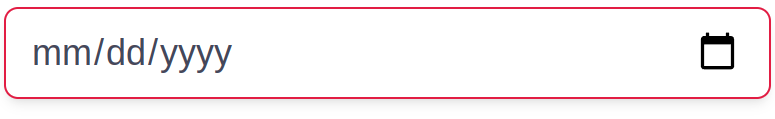
Input of type “date”
Icon, date display format and picker (preview not provided) is browser dependent.
Focused (Google Chrome):
Date selected (Google Chrome):
With isInvalid property set to true (Google Chrome):
Checkbox
Default:
Focused:
Checked:
Checked and focused:
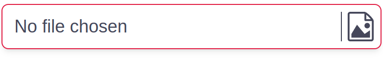
FileUploader
String displayed when no file is selected (here: “No file chosen”) is browser dependent.
Default (Google Chrome):
Focused (Google Chrome):
With file selected (Google Chrome):
With isInvalid property set to true:
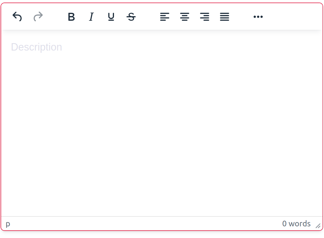
HtmlEditor
Default:
Focused:
Filled:
With isInvalid property set to true:
Buttons
IconButton
Default:
Hovered:
Focused:
Example of use:
EditButton
Rendered as button by default. Provide click handler in ‘onClick’ property.
Rendered as a hyperlink when ‘type’ property is set to ‘link’. Provide ‘href’ property.
Default:

Focused:

DeleteButton
Rendered as button by default. Provide click handler in ‘onClick’ property.
Rendered as a hyperlink when ‘type’ property is set to ‘link’. Provide ‘href’ property.
Default:

Focused:

Display
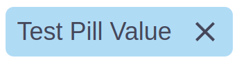
Pill
Default:
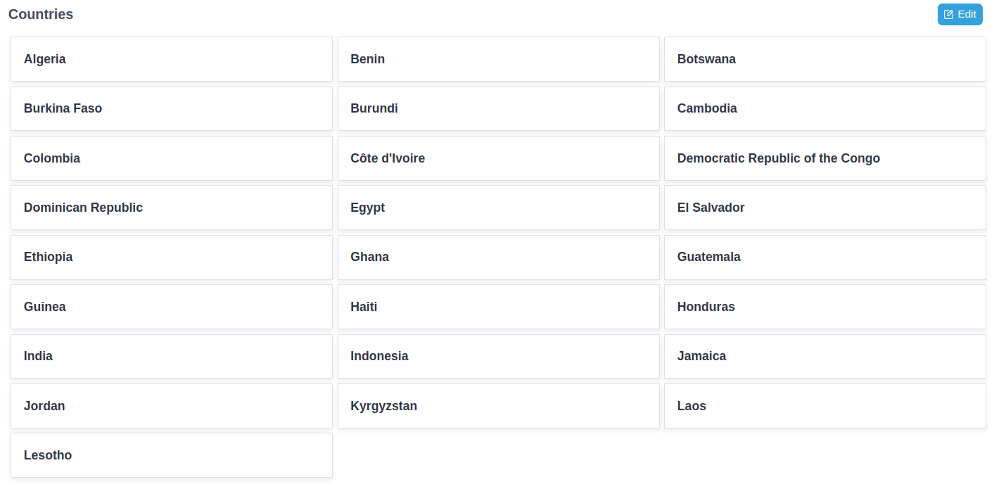
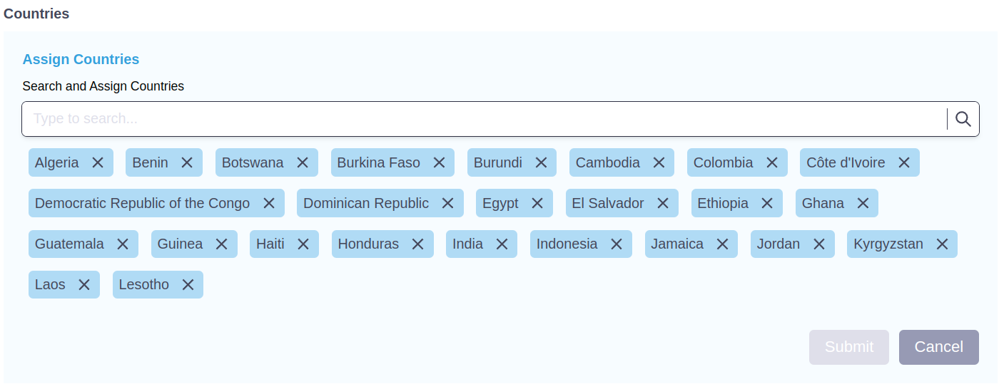
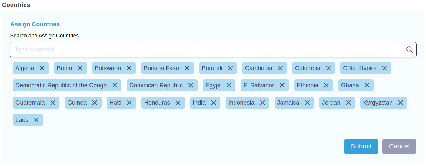
EditableSection
Default (with example of use):
On ‘Edit’ button click (with example of use):
If ‘isDirty’ property is set to ‘true’ (with example of use):
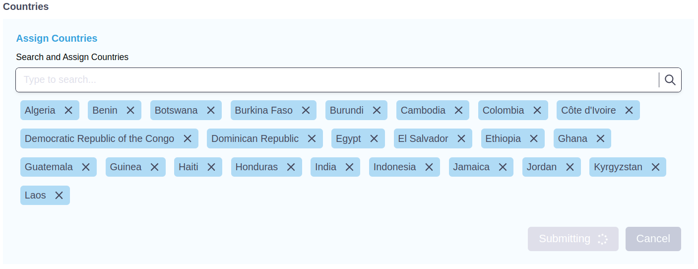
On ‘Submit’ button click (with example of use):
‘Submit’ and ‘Cancel’ buttons are disabled and spinner is displayed as long as ‘isMutating’ property is set to ‘true’
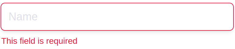
ValidationError
With value property set to This field is required:

Example of use:
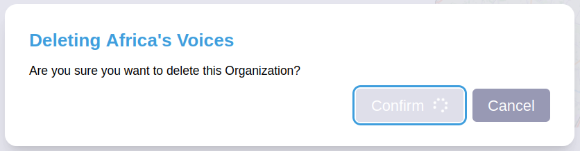
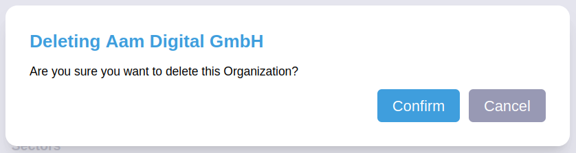
ConfirmActionDialog
Props:
title - title of dialog
message - message of dialog
isOpen -
boolean, show the ConfirmActionDialogonClose - pass handle
functionto hide the ConfirmActionDialog,onConfirm - executes the action after pressing the “Confirm” button
isConfirming -
boolean, iftrue"Confirm" button is disabled and spinner is displayed
Default (with an example of use - Organization deletion action):
On ‘Confirm’ button click (with an example of use - Organization deletion action):
‘Confirm’ button is disabled and spinner is displayed as long as ‘isConfirming’ property is set to ‘true’